Abi Alquran

MUSE Magazine

Editorial Design • 8.5 × 11 Inches
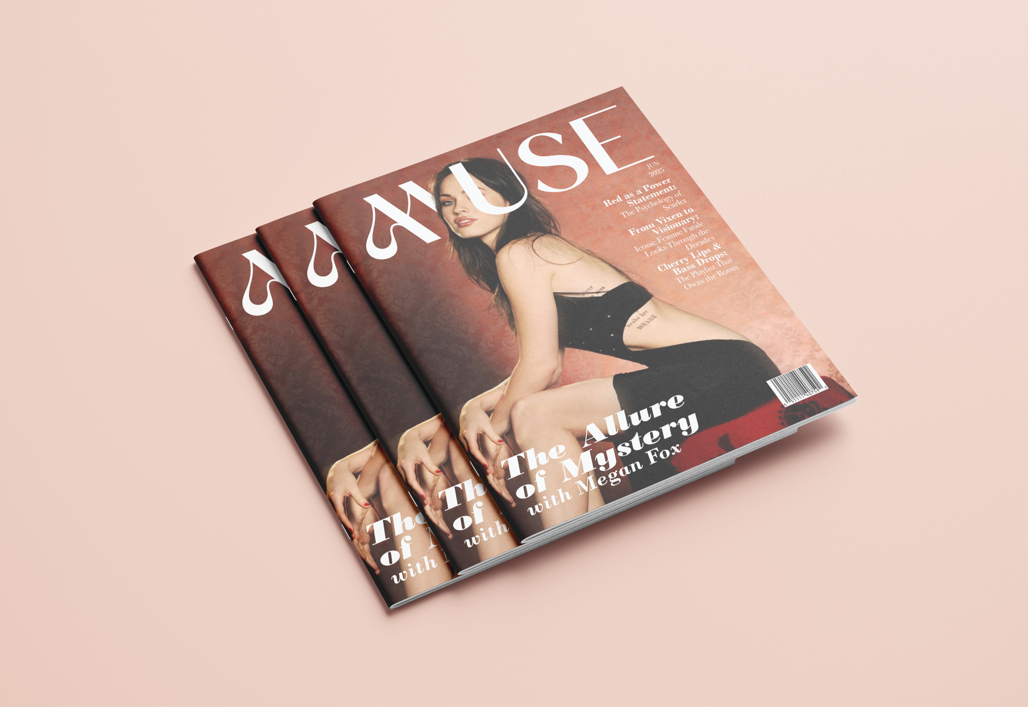

The magazine centers on a red visual language that reflects the publication's tone and layout. The cover pairs a red backdrop with an elegant serif masthead. The prominent shifts in scale and contrast organize hierarchy across the feature lines. The interior spreads expand the system with asymmetrical grids and a purposeful pacing between images and text. The alternating column formats produce rhythm and spatial tension while maintaining readability.